


Five hundred years before flashcards and study apps, people had a creative trick for making knowledge stick in their minds—they turned the alphabet into pictures.
One of the earliest printed examples appears in a 1482 book called Ars Memorativa—“The Art of Memory”—written by Jacobus Publicius and printed in Venice by the inventive Erhard Ratdolt. Publicius was a teacher of rhetoric and grammar, and this book was part of a larger guide on speaking and communication. He wasn’t just teaching letters—he was showing readers how to build “mental shelves” where they could store facts and ideas and pull them back out when needed.
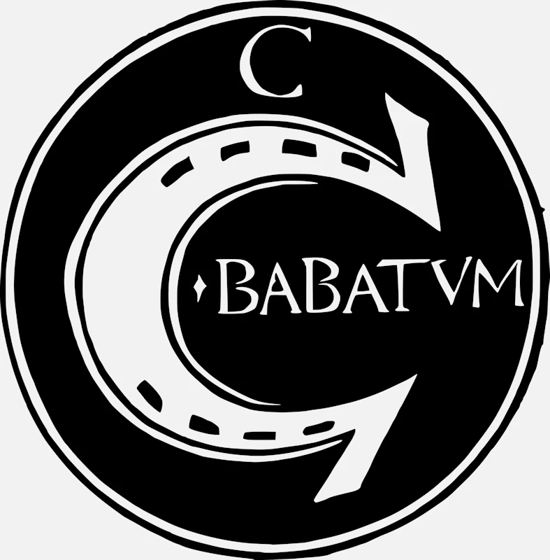
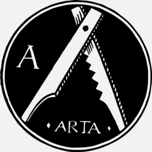
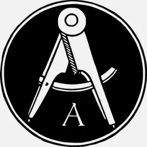
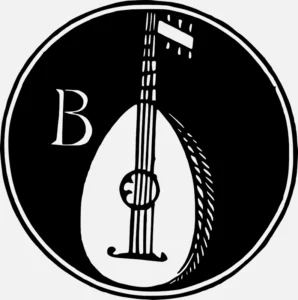
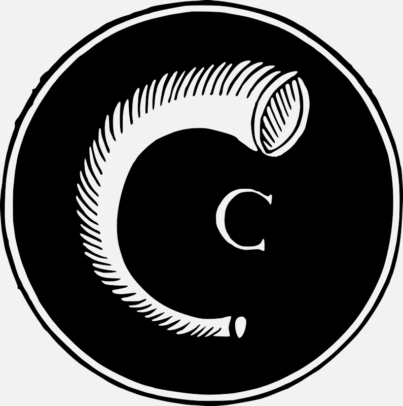
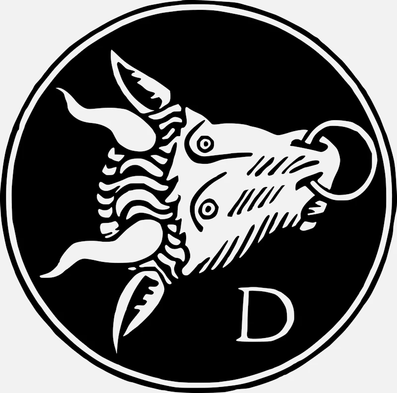
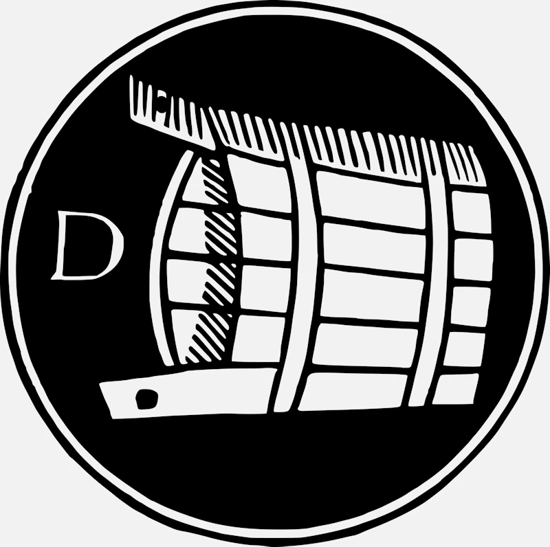
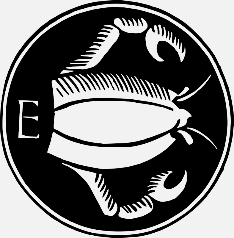
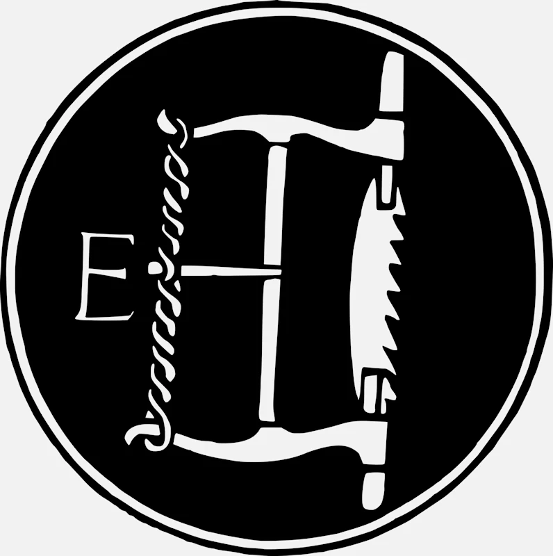
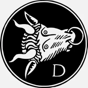
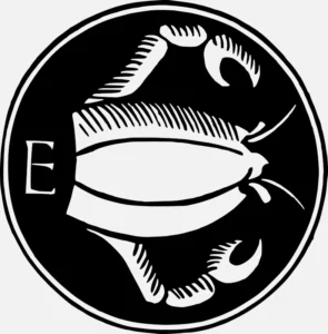
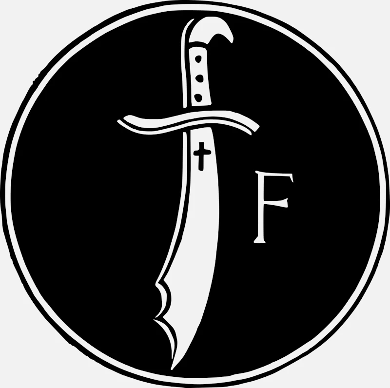
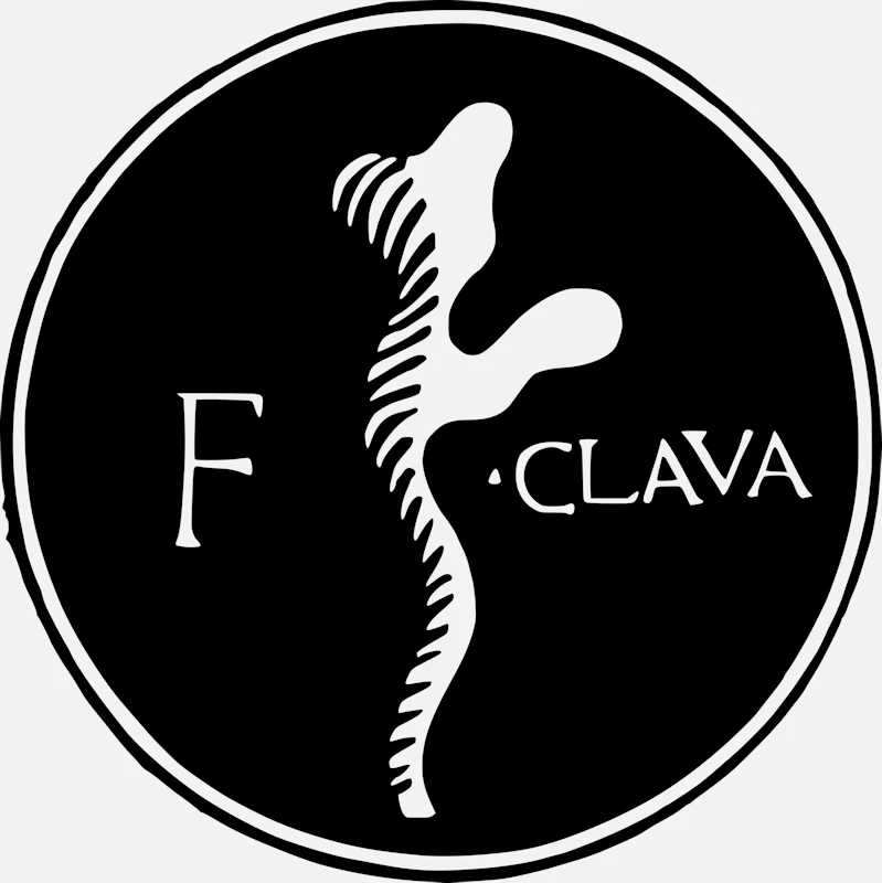
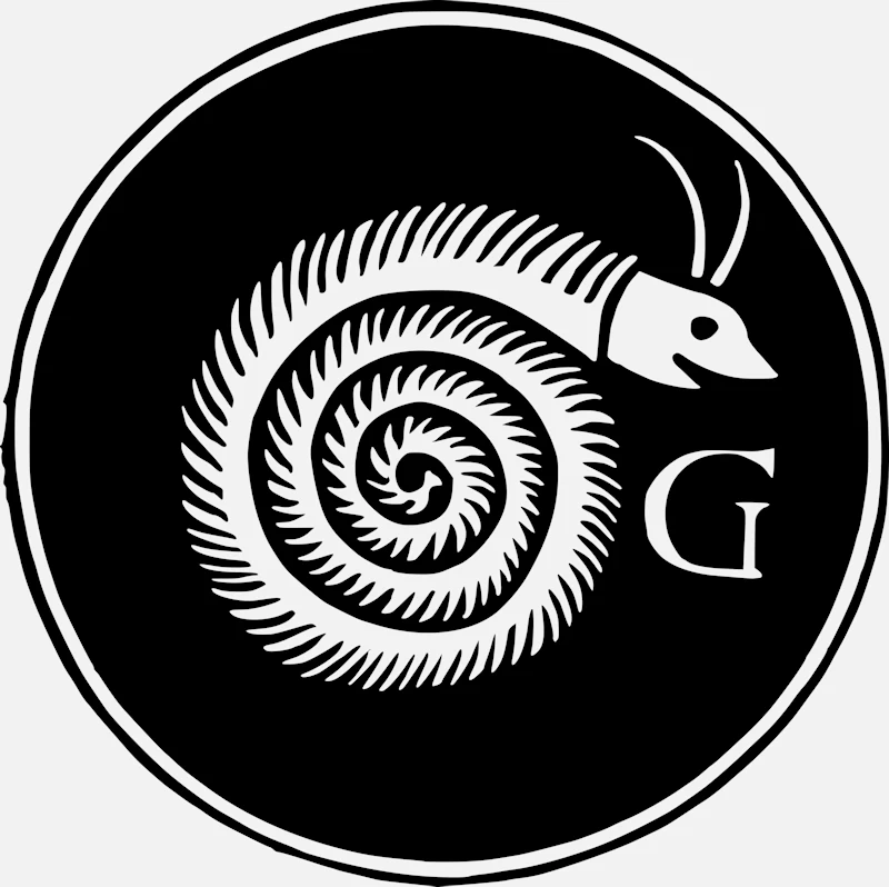
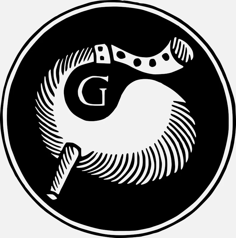
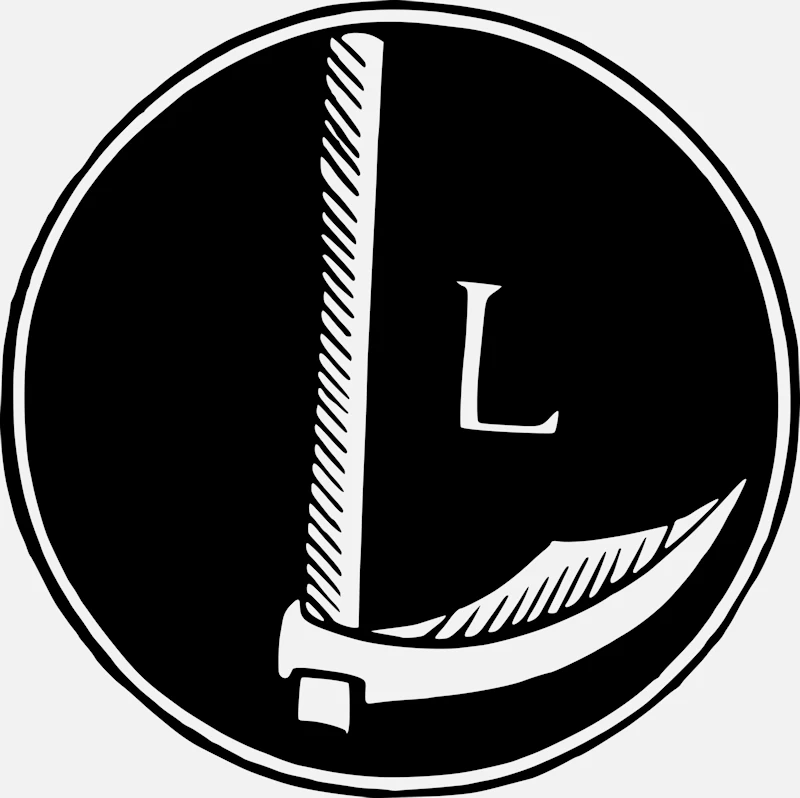
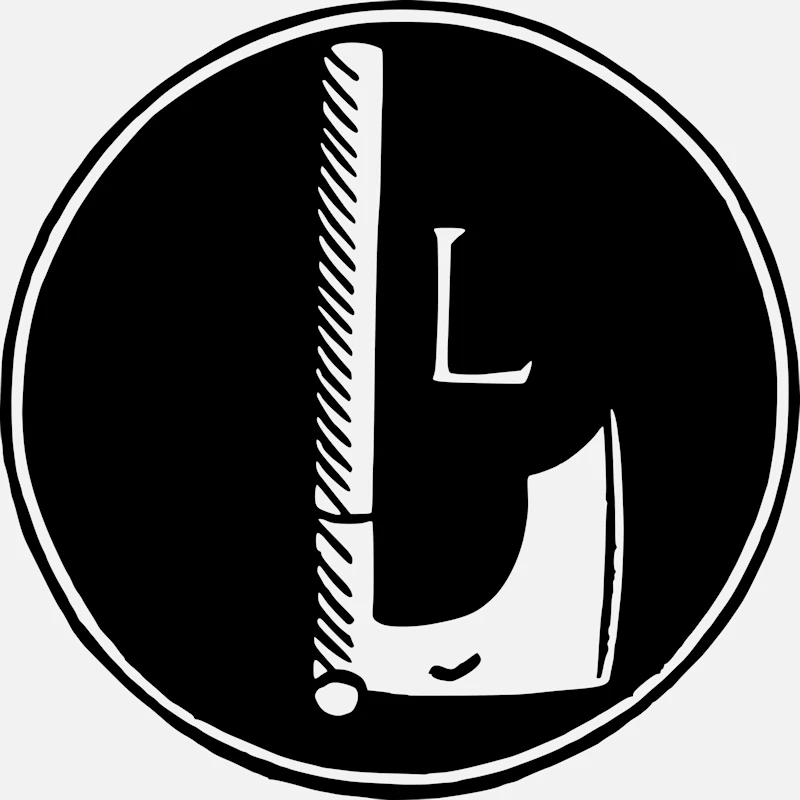
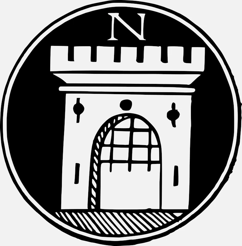
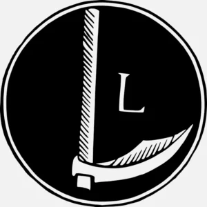
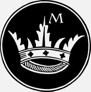
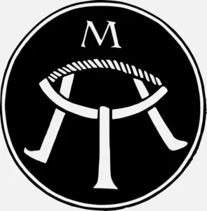
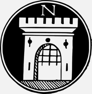
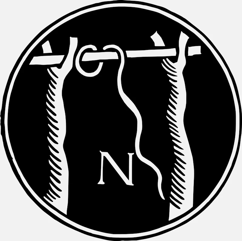
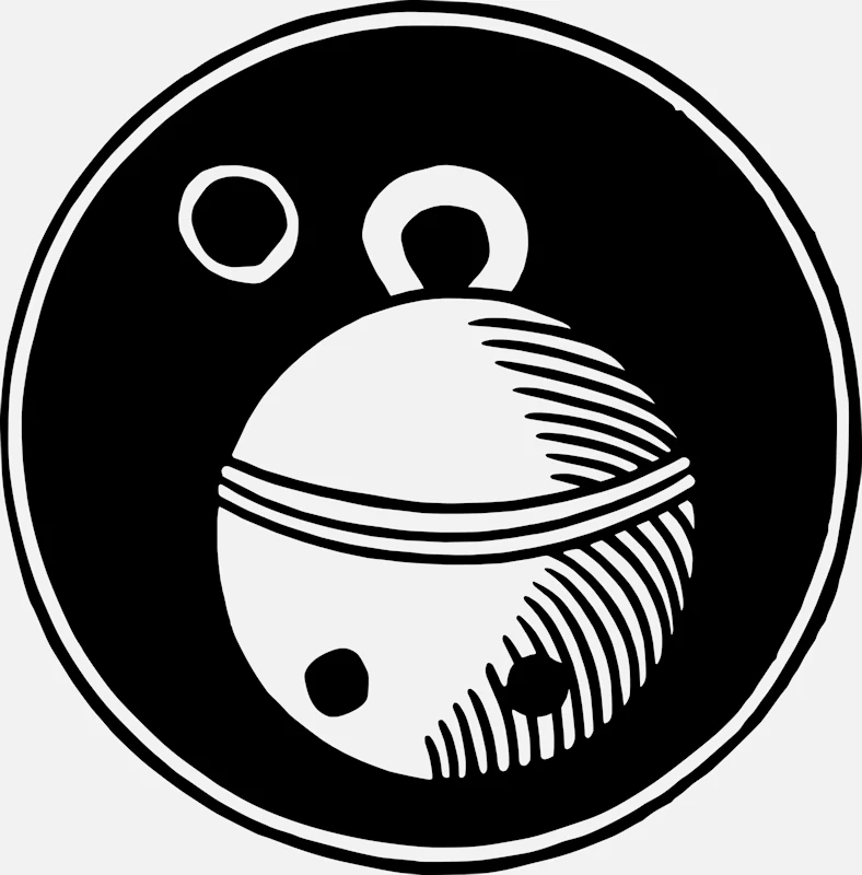
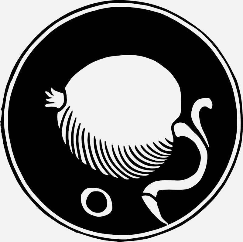
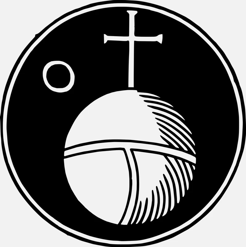
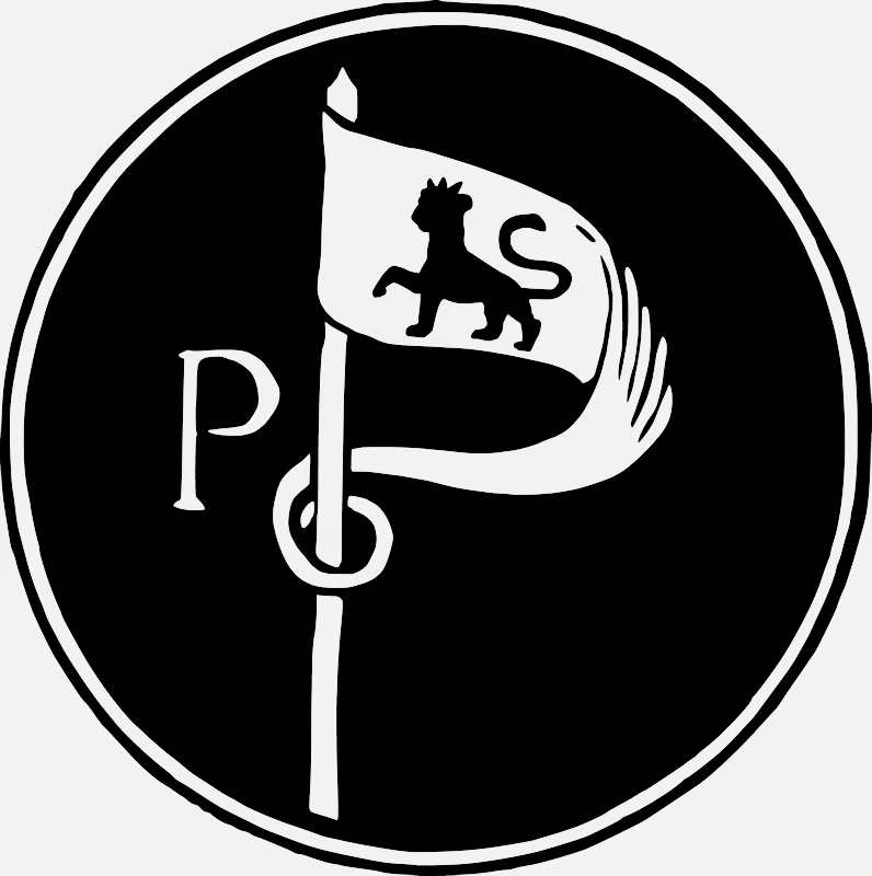
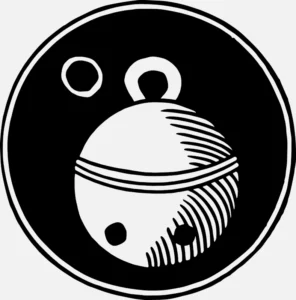
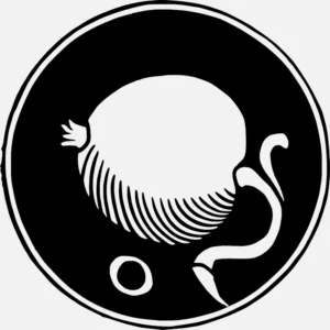
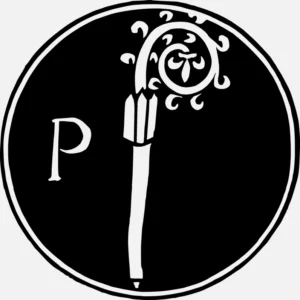
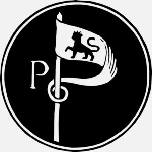
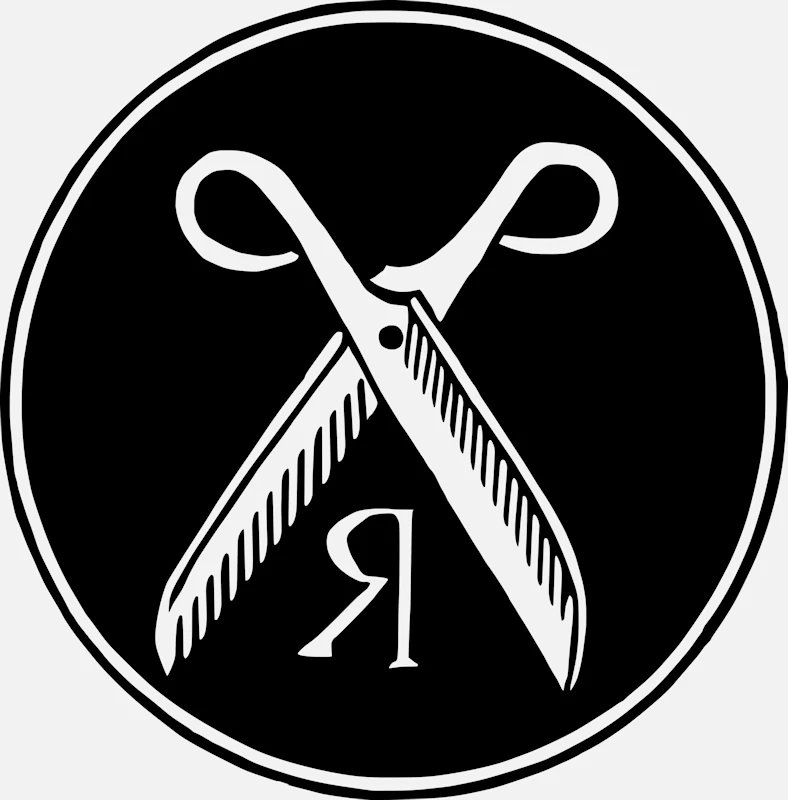
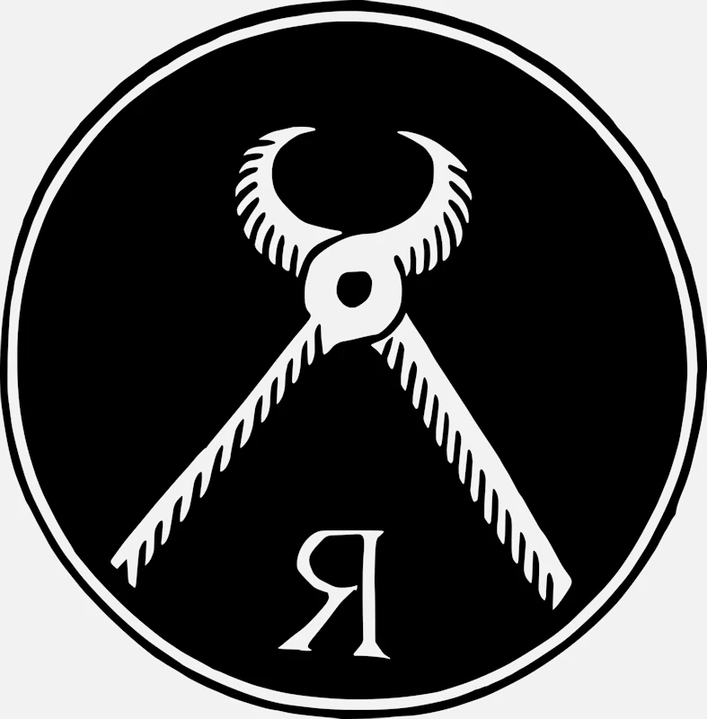
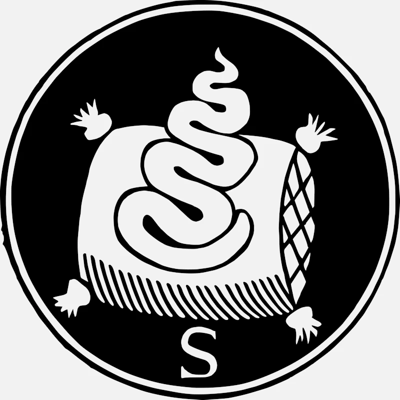
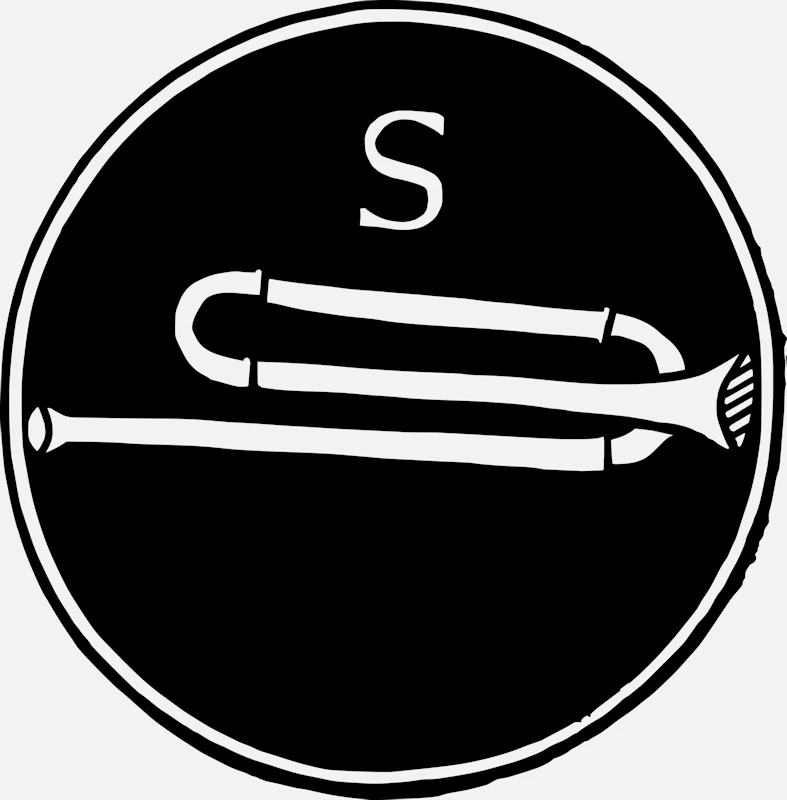
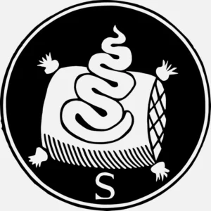
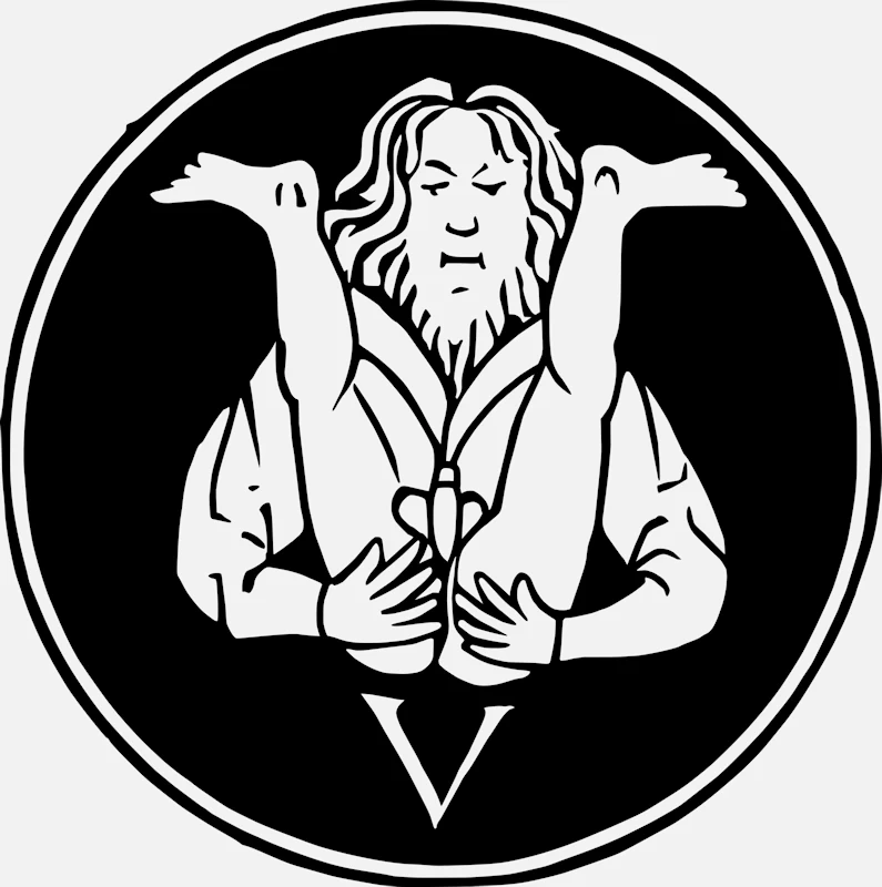
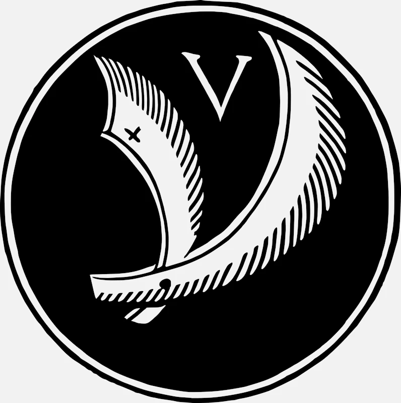
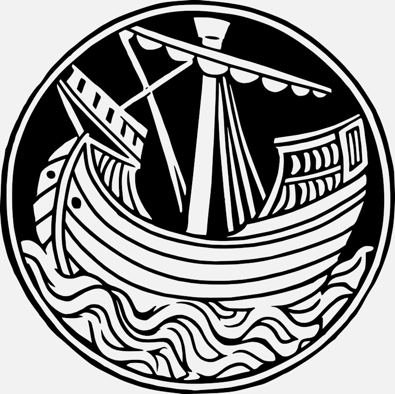
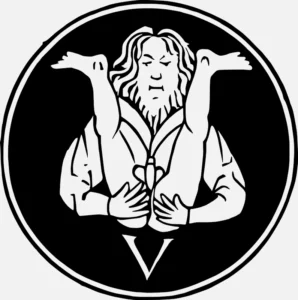
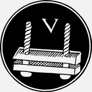
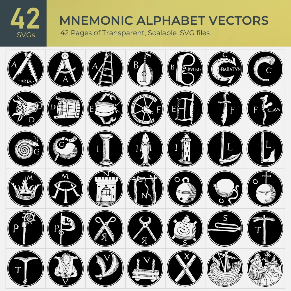
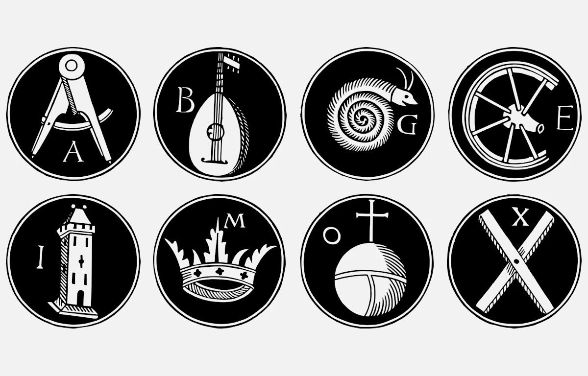
Inside the book is a remarkable set of 42 round illustrations. At first glance, they look like a playful alphabet. But there’s a twist: each letter is built out of an object shaped like that letter. A folding ladder becomes an A. The curve of a horseshoe forms a C. The rounded body of a stringed instrument swells into a B. The goal was simple—pair an abstract letter with a real, familiar image so it would be easier to remember. These letters could then be used as “hooks” to help recall words, names, or even whole speeches.
The illustrations themselves are bold and clean, each framed in a neat circle. This round format came from older handwritten manuscripts, but Ratdolt’s woodcut designs made them sharper and easier to print. In 1482, printing was still fairly new, and Ratdolt was one of the most creative printers in Venice. He was already famous for books with star maps, complex diagrams, and decorated title pages, so this alphabet was right in his wheelhouse—a mix of beauty and practicality.
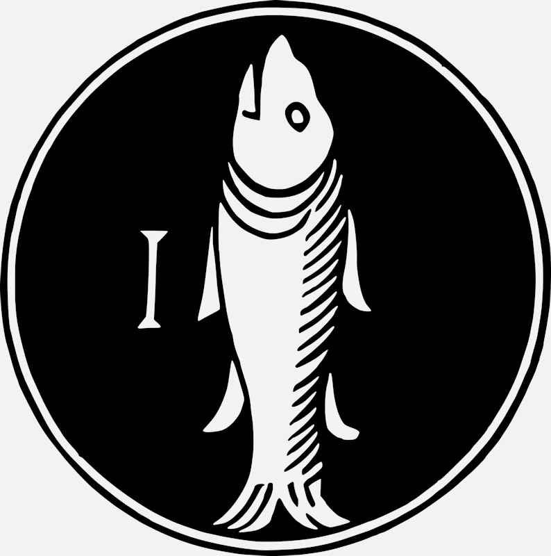
Flip through Publicius’s alphabet and you might notice a few absentees—no H, J, K, Q, U, W, Y, or Z. Did the printer run out of ink? Nope. In the 1400s, the Latin alphabet played by different rules:
U and V were the same letter, just written differently.
J was really just a fancy I.
K and Q were almost never used in Latin.
Y and Z showed up mostly in borrowed Greek words.
W didn’t exist in Latin at all.
As for the extra A’s and V’s, that was intentional—think of them as spare hooks for your memory. One A could be for names, another for places, and another for concepts.
Publicius’s book was one of the first printed guides to the ancient “art of memory,” a technique dating back to ancient Greece and Rome. Great speakers like Cicero described building “memory palaces”—imaginary buildings where information was stored as mental images placed in different “rooms.” Publicius adapted this approach for print, turning letters into ready-made “rooms” or “hooks” on the page. At a time when books were rare and education relied heavily on memorization, a strong memory could be as valuable as a library.
Later thinkers picked up the idea. By the 1600s, people like Robert Fludd and Giordano Bruno were creating even more elaborate visual alphabets and symbolic charts. But Publicius’s set is special—it bridges the gap between medieval manuscript art and the exciting new world of printed books.
Even now, these letter pictures are full of charm and personality. They prove that visual learning is not just a modern trend—it’s something people have always done.
At Tofujoe.com, we’ve restored and vectorized the entire set so you can enjoy them in sharp detail. You can admire the crisp carving lines, the quirky designs, and maybe even try a little experiment of your own: a ladder for A, a lute for B, a horseshoe for C… and V? Well, V might just stick in your mind forever.
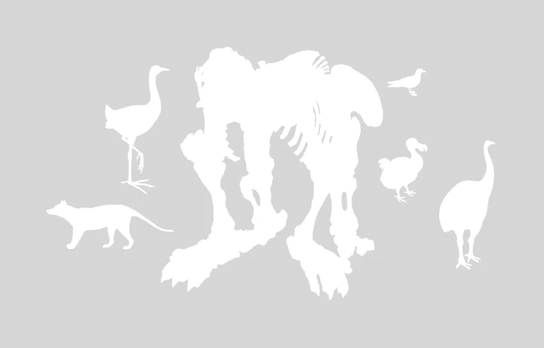
Historical illustrations remind us how fascinating animals can become extinct animals.
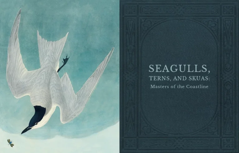
Hide your sandwiches! The seagulls are coming! (And the skuas and terns too).
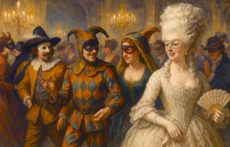
We’ve got you covered for all of your Tea Parties, Calico Balls and Private Theatricals.
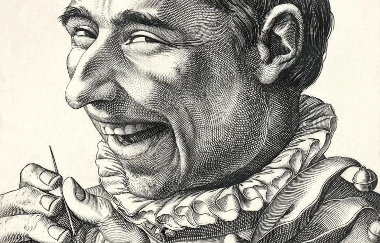
Step right up for a romp through history’s greatest jesters, clowns, and tricksters—laughter (and mischief) guaranteed!
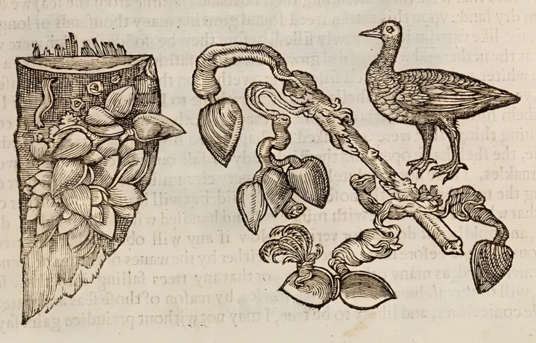
What are barnacle geese and how do they grow? Well, before the migration patterns of birds were known there were some strange ideas about the origin of geese.
Vampire bats, Ghost bats… and uh, fruit loving bats. We got it all!